Happy 1 Year Anniversary Ashton & Thurman!!!!
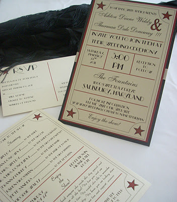
We were extremely excited when we met Ashton & Thurman and heard about their 1940's Old Hollywood theme wedding. Their colors were perfect, black, ruby red and ivory. They wanted their invitation to somewhat mimic a movie ticket but on a larger scale without comprimising the classy tone they were trying to convey to their guests. We immediately started brainstorming and researching this theme and how we could create their perfect wedding invitation. We played around with multiple font types knowing it would be a huge factor in revealing the Hollywood feel of this invitation. By combining the perfect font with ticket-worthy formatting, we created our masterpiece.
Here's what it included:
The invitation itself was 5.5 x 8.5. There were three layers of paper involved; black, a deep red and opal. All three papers were from our metallic line having a slight shimmer effect which gave the invitation the desired hint of elegance. The formatting was a major part of the invitation. Rather than designing the invitation to look like a ticket stub we chose to format it with the look of a vintage playbill. This allowed us to use different fonts and place the typical invitation wording on the invitation in a non traditional way. It doesn't get anymore customized than this! We used a traditional script font with a new york deco font to bring showtime and glamour together. Notice the fun ending..."enjoy the show".
Since the couple only had one enclosure card, there was no need for a pocket fold invitation, which led us to our next idea - the ribbon wrap. We wrapped ivory grosgrain ribbon across the back center of the invitation...the purpose being to hold their reply postcard in place. The post card was printed on the same opal shimmer card stock and we used the same font and red stars that were on the invitation. Reply post cards are a great alternative to the traditional reply card with envelope. It's also a great way to save money since shipping cost is half the cost of mailing an envelope. We can customize any post card to match your invitation.
With the reply post card tucked behind the invitation and the invitation mailed in a matching opal shimmer envelope, this introduction to this Hollywood wedding was complete.
Feel free to email us with questions and pricing information.
****picture reference****
In the above picture is a matching program shown which is printed on the opal shimmer paper. We used the same format as the invitation and added a twist of entertaining wording to the mix. Notice the "starring" category to introduce the wedding party and the repeated quote from the invitation... "enjoy the show".
Ashton & Thurman asked us to design seating chart for their reception instead of place cards - an "awe" inspiring way to direct your guests to their seats.
Check out our previous blog on 5/6/11 on seating plans.


