Wednesday, March 27, 2013

Spring Wedding Inspiration Board II ~ High School Crush


It's still chilly and even snowing BUT we are not giving up on the arrival of Spring. How can we not think Spring with the Easter bunny coming this weekend. Every passing store is covered with different shades of pastel colors from tiny little eggs to decadent wrapped chocolates. And we can't forget the sweet smells of daffodils and tulips. COME ON SPRING!!!! As we keep pushing forward we take a look at a terrific Spring color... lilac. 

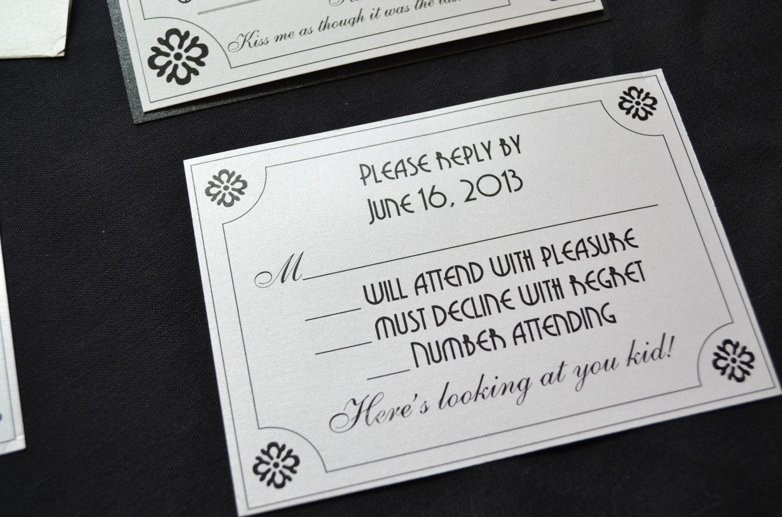
An invitation doesn't get any prettier than this. We used a lilac hand made paper to create this custom pocket fold invitation. Check out the detail of this lilac pocketfold cover - the paper handmade, crushed to give a wrinkled effect and coated with a mica shimmer to convey a metallic look. Keeping with the shimmer line the invite is printed on a white shimmer card and backed with a silver shimmer paper. Overlaying the invite is a clear vellum with a sweet saying..."All because two people fell in love... All enclosure cards including the reply card, reception card and directions, are also printed on the white shimmer card stock. One of the first signs of Spring besides a robin is when tulips start popping out of the winters ground. When you mix those white tulips with some lavender, can you just imagine the fragrant smell of this bouquet??!! Your wedding colors can be incorporated throughout so many parts of your wedding ceremony and reception - even in your drinks. Be creative and create your own wedding day cocktail for your guests to enjoy. Color can also be displayed at your tables. Say no to the classic white linens and yes to a lilac and white damask print, always ask the vendors what they can do or provide that's unique and more accommodating to your wedding theme!


For pricing and more information on our High School Crush invitation set email us at:


Saturday, March 23, 2013

Movie theme wedding invitation ~ Casablanca


You can certainly make any idea come true for your wedding. With a little thought and some details, a vision can come to life. Sometimes it's not just colors, flowers or a theme that fits the bill. If you're looking for romance, why not start incorporating your ideas into your invitation?!?! Your wedding invitation is that little something that allows your guests not only know who, what, when and where...but also sets the tone and enlightens them on what to expect on this big day!!! Let it be an introduction, a little peek of what's to come and let it be a part of you  and what you have dreamt this magical day to be. We did just that with this invitation set we call... Casablanca.

Some movie fun facts :)

Casablanca is a classic romantic drama film that was released in 1942 and directed by Michael Curtiz. There are many legionary actors in this movie such as, Humphrey Bogart, Ingrid Bergman and Paul Henreid. Based on an unpublished stage play called "Everyone comes to Rick's", this classic love story was set in the Moroccan city of Casablanca.

So how do we incorporate Casablanca into a wedding invitation you ask??? Piece of cake!!! Okay, maybe not that simple but, with a bit of research and some deep thoughts we created a detailed invitation that represents this classic movie in more ways than one. First things first...where do we start?????


Since this movie was set in the 1940's we decided to start with one of our popular old Hollywood invitations we named, Glamorous. This over sized invite with an old movie program format is just were we needed to begin. Our first fine detail would be what papers to use. Deep reds, black and gold are always a great pallet for an old Hollywood Movie theme wedding but we decided to stick with the classic black and white colors (or not:) keeping with the black and white film style. We used the shimmer paper line in this new creation, just as we did with the Old Hollywood invitation as well and tweaked the format to go with our Casablanca theme. We changed the stars to a different design, something a little bit less showbiz and a little more Moroccan, hence the movie set.


Our first detail we will share with you is at the bottom of this large invitation. We took a line from the movie and placed it at the bottom; "Kiss me, kiss me as though it was the last time!"


We decided to add more quotes from the movie throughout the invitation. We continued this theme on the reply card and reception card as well. 


"Here's looking at you kid!"


"Of all the gin joints in all the towns in all the world, she walks into mine"


What we had so far, with the many details was great...but we needed just one more thing to tie this whole dream movie wedding all together. Something to make you whisper...CASABLANCA!!!! We put our thinking caps back on and started to dig a little deeper in our research. From researching we found one major component that was a constant design in Morocco, the lattice style windows and unique doors. When creating a Moroccan style wedding invitation we thought of lattice style window on a cover to mimic the style of the windows and doors you can find throughout the city. Can WE do that? Of course we can :) But we wanted to combine that with the original movie theme invitations we were creating. So let's go back to Casablanca...after looking at some film clips of the movie we had a great idea. A main focal point of the movie was Rick's Cafe Americain. The entrance of the club had two Moroccan style doors. Why don't we create a cover for the invitation that replicated the doors in the movie? DUNZO!!! To add a little bit of a pop we used a silver shimmer paper to wrap around the invitation creating a gatefold cover. Down each side of the flaps we created a lattice look. Your guest will open this unique wedding invitation and piece together all the small details and know they won't want to miss this star studded wedding.


 And there we have it... our Casablanca wedding invitation.

The End!!!


This 1940's Old Hollywood invitation set can be purchased in our Etsy shop below:
 
For more information or pricing please email us at:

Wednesday, March 20, 2013

Spring Wedding Inspiration Board I ~ Vintage Lace

As Winter transcends into Spring, we are struck by an overwhelming feeling of newness, a little bit of softness, undoubtedly a quest for romance! Not sure about you, but when we think soft and romantic, we think lace!!! What a great time to be a designer when lace is everywhere - we're OBSESSED!!! So let this be your warning...this will be the first invitation set from us you see with lace, but unmistakably NOT THE LAST:)  While the Cherry Blossom trees are flowering, about to burst and the grounds are still sparse we welcome this new season with our first Spring Wedding Inspiration board carrying out the gentle softness of this blossoming season.

Let us introduce one of our newest invitations samples we call Vintage Lace. We designed this modern invitation with a mix of recyclable papers. We chose a light taupe paper to create the square cover. The invitation is simply printed on a recycled cream card. We used a combination of two beautiful retro inspired fonts to take this invitation to the era where it belonged. With a hint of peach for their names and finally wrapping this beautiful wedding invitation in a dainty lace ribbon, this invitation is complete. We designed the reply card into a post card which was printed on the same recycled cream card matching this vintage style wedding invitation. This nostalgic invitation was matched with a beautiful wedding dress in, well lace of course, a decadent ruffle style wedding cake with a tiny touch of peach flowers and lastly Chanel nail polish in Miami Beach.


For more information and pricing
on our Vintage Lace invitations set please email us:


Monday, March 18, 2013

The Hydrangea - A Botanical Inspiration


The color wheel - The 1st color wheel was invented by Sir Isaac Newton. In 1666 he discovered that light refracted by a prism created the colors red, orange, yellow, green, blue, and violet. He then arranged these colors in a circle creating a color wheel. This color wheel was the 1st to be used by artists.

About 100 years later Johann Wolfgang von Goethe studied how these colors made us feel. He then divided the color wheel in to 2 halves, a plus and minus side. On the minus side he placed green, violet and blue which we now call cool colors. On the plus side he placed red, orange, and yellow which we now call warm colors.

Sometimes when brides come to us with their wedding color combos, it's easy to visualize colors what will clearly be a great match. And for those who have a clear case of colorblindness, we always use our best judgement and try to guide these couples in the right direction. On the other hand we are sometimes pleasantly surprised. By no means are we boasting our skills, or questioning others for that matter but sometimes we just wonder...what are you thinking???  While we are never afraid of color, let's face it, we downright welcome it and even with our experience and expertise, we too sometimes wonder if too much color is just 
TOO MUCH?

For this particular situation, the answer to this question is definitely not!!! The cool side of the color wheel won the battle on choice of colors in this botanical inspired wedding invitation set.

When planning a wedding typically one chooses a theme to get the ball rolling. This theme slowly becomes an obsession in which you're compulsively seeking any who, what, when, or how it can be incorporated into your wedding décor and planning. Unless you're a themey person who craves that sense of direction, not all weddings have to be a theme. And if you're somewhere in between why not let your color, or colors, be your theme. As you can see in our featured couple's invitation choice...colors and simplicity ruled this battle! Multiple colors being "married" into an invitation set was the quest for this classic yet modern couple. Mariam and Todd came to us wanting single panel cards, but not the typical thin card with a silver embossed border. They wanted color to be their theme...and we quote them asking, "Can our colors be our theme"? Hey, why not?! The colors shown: crystal, light green, lilac purple and bluebell all derived from their choice of flower, the hydrangea. Each card has an obvious purpose, one being the invitation, a reply card, and an information card. They chose the light green shimmer card to showcase their wedding invitations, the lilac purple was designated as the information card and the shimmer blue card took the place of the reply card. We felt their original theme turned into a perfect design, very simple but well executed.


For more information on the Colors of the Hydrangea Wedding invitation set contact us @
invitationsbythisandthat@live.com

Saturday, March 16, 2013

Information Cards ~ Wedding Invitation Set

When you're picking out your wedding invitations, or if you're going with us you'd be designing your wedding invitations, you are asked the normal who, what, when, and where questions. Whether we are meeting with a new couple, or creating a new invitation set for someone across the country, we always have our couple's fill out a bridal form to pin point the details. Amongst these ceremony questions, are also questions concerning the details of the RSVP card, hotel card or accomodation card, direction card and possibly a registry card. All of this information is not only important for your guests to know, but also a nice gesture of information to incorporate in an invitation to a big event.

Many times some or all of these usual suspects, better known as cards, (hotel, direction, etc.) just don't fit the bill, so that's where the information card comes into play. Lately, we've either been encountered with our couples having an ample amount of information leading them to have 2-3 information cards other than their reply card or on the other hand, we will have some couples only needing 1 card with the lowdown of 3...what to do???!!! It's simple friends...an information card.

Having a card simply labeled "INFORMATION", "THE NEWS", THE FEED" or however you wanna say it, we can create this card to cover your key information. Even if you don't have an exorbitant amount of information but you need your "choice" messages and instructions expressed to your guests it can be done on an info card. Look at some examples below of different information cards we've created in the past:


Our "Ticket to Broadway" wedding invitation set had a Broadway theme which was carried over to each card included in the set. We designed an information card which was dually labeled "Broadway pass" a bit of fun play with the wording:)


~~~~~~~~~~~~~~~~~~~~~~~~~~~~~~~~~~~~~~~~~~~~~~~~~~~~~~~~~~~~~~~~~


The next invitation set named "Colors of the Hydrangea  also had an information card. The couple, who was married at the Ocean Pines Yacht Club in Berlin, Maryland, wanted the hotel information and directions included on one card. Ask, and you shall receive!!!


~~~~~~~~~~~~~~~~~~~~~~~~~~~~~~~~~~~~~~~~~~~~~~~~~~~~~~~~~~~~~~


Information cards are also perfect for destination weddings. A lot of times with a destination wedding you may have a weekend of activities planned for you and your guest. Supply them with a single card listing when and where they can meet you for some pre or post wedding fun. We did just that for two of our couples who both had a Miami Beach, Florida destination wedding.


Our "Destination Miami" invitation was simply titled "Info". Listed on this white card with blue shimmer border is directions, suggested hotels and a little note to their guests to make sure they take advantage of their time away and get in some rays while they celebrate this little wedding vaca.


~~~~~~~~~~~~~~~~~~~~~~~~~~~~~~~~~~~~~~~~~~~~~~~~~~~~~~~~~~~~~~~~~~


Our second destination couple picked our "Tiffany's at the Beach" invitation for their Miami wedding. Their information card was named "Festivities". Listed on this card was information such as their welcome party, wedding day, farewell brunch and wedding website.


For a detailed look at our invitations mentioned please see our past blogs:

Ticket to Broadway
 
Ticket to Broadway for purchase in our Etsy Shop below:
 

Colors of the Hydrangea

Destination Miami

Tiffany's at the Beach for purchase in our Etsy Shop below:

For pricing and any other questions email us at

Tuesday, March 12, 2013

St. Patricks Day Wedding Inspiration Board

How do we know Spring is just days away - when you look on your calendar and see St. Patty's Day is soon approaching. Shades of greens, yellows and well...the whole rainbow are found during this festive holiday. Not even having to mention the ol' pot of gold and rainbows the Irish are naturally lucky...and to be in love - who wouldn't want to get married on St. Patrick's Day at the kick off to Spring wedding season.

To get you in the Irish mood we decided to go with our Kiwi Island invitation. Let's start at the bottom and work our way up. We used kiwi color card stock and layered it with a bright white corrugated card. To top of this beautiful St. Patrick's Day invitation, we printed on a shimmery green vellum, which when slightly turned you'll see slight hints of gold.  This over sized square invitation is perfect for this Spring holiday. Before the invitation is the Save the Date!!! With a cute design and matching green color we can transform your save the date into a save the date magnet. Hydrangeas are becoming a very popular wedding flower. With these full pom pom flowers and beautiful shades of green, what's there not to love. For the big day we know how any Irish loves gold. Look at this gorgeous gold wedding set with Irish love knot design. 


For more information and pricing email us at: