Showing posts with label wedding invites. Show all posts

Saturday, July 21, 2018

Spring Chevron


Are you starting to plan your Spring wedding? Looking for a great color combination for the wedding???
Start with the invitations!!! Here it is..this modern invitation has an elegant feel and modern flare using a mix of a fun color pallet and modern print. 


Here's what this beauty entailed:

This square invitation starts with three layers of card stock. The bottom layer is a deep gray shimmer card stock followed by a smooth yellow color card bordering the bright white card used for the invite. This very clean and simple invite is printed on the white card stock using delicate fonts. Taking lead of the wording are NO OTHER than the bride and grooms names!! Using the band of chevron to wrap the invitation; this invite is a great alternative to the pocketfold invitation when there is only one enclosure card to tuck behind. A yellow and white chevron printed paper is wrapped across the back to add that some dimension and detail while acting as a belt to hold the reply post card. The same fonts used on the invite are carried over to the reply post card continuing that clean sharp look. 


For more information and pricing on this beautiful invitation set, check out our Etsy Shop below:
Spring Chevron

To see the inspiration wedding behind this invite, check out our blog post:
Featured couple ~ Franny & Josh Johnson

Thursday, May 15, 2014

Featured Couple ~ Cassie & Brett Staley


Cassie & Brett Staley
June 15th 2013
Nassawango Country Club
Snow Hill, Maryland


Theme: lace, handmade, outdoors
Colors: cornflower blue, shades of pink 
Location: Nassawango Country Club


Typically the colors used for your wedding invitations are the main colors used in your wedding. We've had many brides show us their wedding colors using everything from dress and paint swatches to fabrics and ribbons. Cassie came to us with something different. She brought us a lace swatch and wanted to convey the earth friendly feel with a color no one would be wearing in her wedding party, however it would be used in their hand made bouquets and as the color of  her cupcakes design. Cupcakes??? That's right, we're using the color of frosting for cupcakes along with their flowers and matching it to the ribbon wrapped around the invitation.  


Cassie was having multiple colors used throughout her wedding. The bridesmaids were wearing darker cornflower blue dresses but the flowers and other accents would be of a very colorful pallet. The other main accent was lace. Lace was on her beautiful dress, around each bouquet and bordering her gorgeous veil. So far we have peach/pink and lace what element is next????? Lets incorporate the "hand made" and outdoor feel that you will see throughout their wedding. We used our favorite recycled papers and hand crafted a unique invitation with a hint of modern and a touch of vintage formatting. WOW!!!! That's a whole lot of thought for one invitation. But that's what our couple did for their big day, put a whole lot of thought and love into every detail.


We always say how your invitation is an introduction to your wedding. Your wedding invitation allows your guests to see what they are in for and Cassie & Brett's wedding invitations show their guests just that. We married modern elements with a little bit of vintage in this classy outdoor wedding with only the environment as their back drop showing little details can have big meanings.


This hand made arch was made by the father of the bride. A beautiful piece that added such elegance to their nature filled back drop. What a great setting for a picture perfect outdoor wedding.


For more information on Cassie & Brett's invitation "Modern Lace" see our past post:
Modern Lace

Email us for pricing
invitationsbythisandthat@live.com


Pictures are courtesy of Epic Photography

For more information and to be able to view their portfolio
 visit their web site below
Epic Photography

Make it Epic!


Tuesday, May 13, 2014

Victorian Charm


The following couple is, although not near, they are dear to our hearts. It's good old Aunt D and Uncle Steve!!! Knowing her and knowing her well, we knew that we'd have to step it up to fulfill her wedding invitation dreams. She is very elegant and sophisticated and wanted her invitations to convey the same look. The location was pristine!!! The Inn on Broadway in Rochester, New York has a very Victorian feel to it, but quaint enough to still be charming. With that said, the décor was impeccable so Diane & Steve didn't need to gussy up the already flawless palette. With that said, a color scheme was still up in the air. Diane explained that the bridesmaids would wear black and carry red roses. She continued saying she wanted a timeless, yet Victorian and avant-garde feel, but simple...hummmmmm. WE WERE ON OUR OWN:) We took it upon ourselves to keep it clean and simple and add a small touch of color...here is what we did:


We started with the wedding invitation and immediately chose a very tight script font to display and announce a bit of formality for the festivities to come. We chose a cream linen cardstock to print the invitation. Once again, we wanted that sophisticated look and linen is a great go-to when you want to class it up:) Since their wedding date was in the Fall, we chose a burgundy cardstock to border this classy invitation, but we didn't stop there. Still, we felt that this invitation was still lacking the ornateness that was necessary for their wedding invitations. And then our AHHHHAAAA moment...a wrap! But not a typical wrap. We wanted something so stunning, so when their guests open the envelope they would say WOW. We found a beautiful handmade ivory paper with gold rings embellished throughout. We finished this set with a sheer burgundy ribbon. They're set included matching linen ivory reply cards and reception cards. Diane & Steve were floored when they saw what we created...it was a great feeling:)


 For pricing and more information on this invitation email us at:


Sunday, April 27, 2014

Spring Wedding Inspiration Board II ~ Aqua Marine


Spring is finally in full force. April rain bringing May flowers is exactly what a bride wants to hear. Soft shades of greens and yellows are matched with bright oranges and pinks to welcome the month of May. Being as we have slightly more predictable weather in May, warmer temperatures and a little less rain than April, May is a great wedding month. With all of last month's rain, Mother Earth is illuminated with natural backdrops of flowering trees and radiant blooms. It's definitely a great time to have your outdoor wedding. 

  A very popular color this time of year is green. If you just take a look around when the trees start budding and their leaves start unfolding, you will see many many shades of green. When we think of outdoor wedding, western weddings strike a chord! Western outdoor weddings don't have to be in the Fall with cliché colors of browns and oranges. You can have a softer pallet of soft greens and light pinks and still carry on the cowboy theme wedding you desire. Below you'll see our Aqua Marine wedding invitation set. This light teal invitation set is normally favored by our beach wedding brides, but CLEARLY is a perfect compliment to a country style wedding. This time we are going to hold off on the flip flops and throw on some cowboy boots. Knee length bridesmaid dress in a soft mint color can be paired with brown classic cowboy boots. How about using color for your cake???? Light colored ruffled layers give this cake texture and style. We can't forget the cowboys in the wedding!!! Put a little western flare in their boutonnieres with a soft aqua colored feather with  some none traditional floral accents. 


For pricing on our Aqua Marine invitation email us at:


Saturday, March 15, 2014

St. Patrick's Day Wedding Inspiration Board ~ Aspen Escape

Green is the way to be especially if you're talking about St. Patrick's Day! We've created this St. Patty's Day inspiration board with both the color green in mind as well as our inner earth friendly green part too. What better way to announce a green holiday than with our ultimate earth friendly post card wedding invitation! We printed this earth loving invitation on 100% recycled kraft card stock paper using 100% post consumer waste. Using the least amount of paper possible we printed our eco-friendly invitation on both sides of this recycled paper instructing your guests to reply online to your wedding website. So what does this mean?
NO REPLY CARD +
NO INNER ENVELOPE +
NO OUTER ENVELOPE =
LESS WASTE

So this is our take on green for our St. Patrick's Day wedding inspiration board...check out what we included below. Going for simplicity, we chose this white dinner napkin wrapped in a little bit of nature, simple yet stunning. Next we have repurposed light bulbs!!! These dainty little transparent pieces of art can filled with flowers and greens and hung for an organic décor piece. Lastly, we have recycled bottles. These colorful beauties can be picked up cheap at thrift shops and antique stores and recycled into centerpieces, drink pourers or vases at your green wedding. Happy St. Patrick's Day!!!


For more information on how to make your wedding earth friendly please contact us at:

Check out our past blogs on earth friendly invitations and St. Patrick's Day invitations:

Sunday, February 16, 2014

Our NEW sample: XOXO


We noticed our portfolio was missing something. What were we missing? A NEW sample just in time for the biggest love day of the year! Valentine's Day, of course!!!! We decided to stick to the basics and work with the most common Valentine's Day color, red. 


Sandwiched between a layer of black and a layer of white card stock lies a bright red card stock. We gave a little bit of a modern touch with the formatting while adding even more red with a few keys word. The reply card and direction card followed suit with the same formatting and white card stock as the invite.


Our XOXO is available to purchase in our Etsy shop:

Wednesday, April 13, 2011

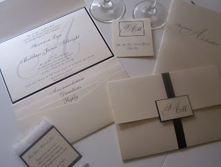
Matt & Shannon Albright 4/10/10

Happy Anniversary Shannon & Matt!

Here's what their invitation order entailed:
First we started with save the date magnets.
Then the invitation...
Large pocket fold invitation in opal shimmer, invitation backed with black, matching outer monogram tag and black satin ribbon wrap.
Enclosure cards included, reply card, direction card and accommodation card all in opal shimmer.
Matching opal shimmer envelopes for reply card and outer envelope.
Booklet programs in opal shimmer, natural white inner pages and thin black satin tie ribbon.
Tall place cards printed on opal shimmer with monogram.
Tissue cards in opal shimmer and black. (these are too cute, thanks Shannon)

What a great invitation set! From the elegant large invitation to the matching monogram place cards, everything was a perfect match for their black tie affair.

This invitation can be done in many different colors. Please contact us for pricing and more information. invitationsbythisandthat@live.com